2.0.1 update
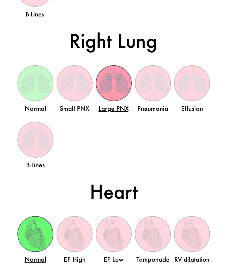
Quick update pushed out today with minor changes to the interface when setting up your scenario. The contrast ratio between selected or unselected pathologies (red color) have been increased so that it's easier to discern what pathology that's currently selected. To make things even clearer, the associated text below the current selection is now underlined. Hopefully these changes will make the interface easier to navigate and use, and if you are affected by color blindness, the addition of underlined text will make a big difference.
Big thanks to Niels Castle of SimMon app fame for providing feedback and suggestions!

